

April 19, 2016 - 1:18pm | A few I've thrown together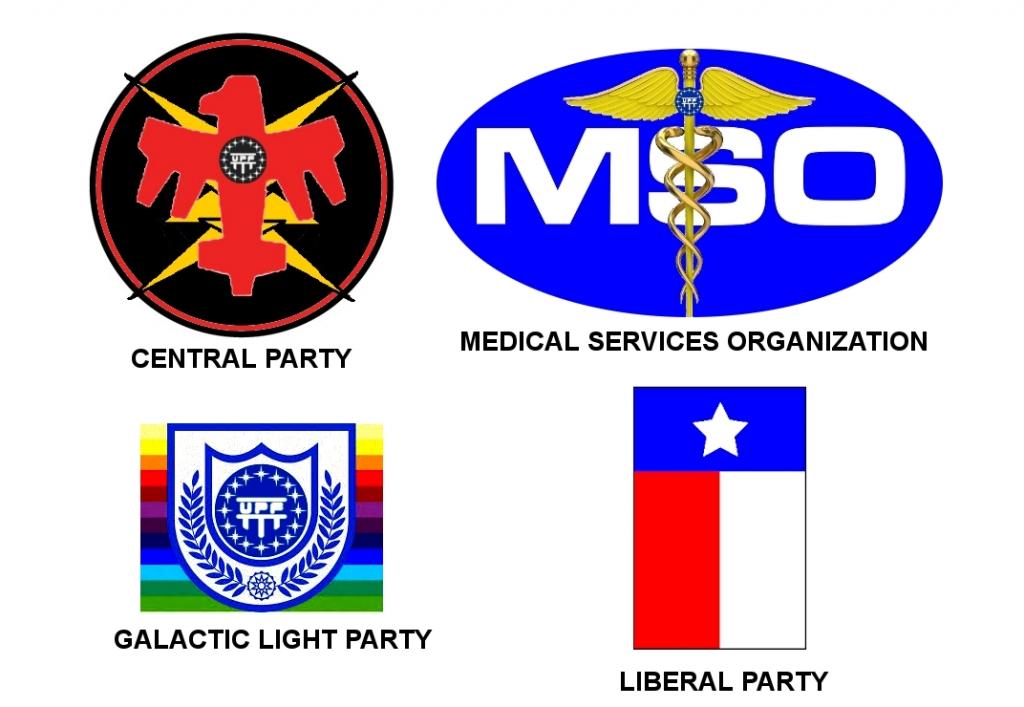 made from clipart I found online and the alternate UPF logo thats somewhere around here. The part of the Galactic Light logo that is the Buck Rogers Federal Directorate logo is by viperaviator at Deviantart. Alternate Central party logo made from clipart and the alt UPF logo. 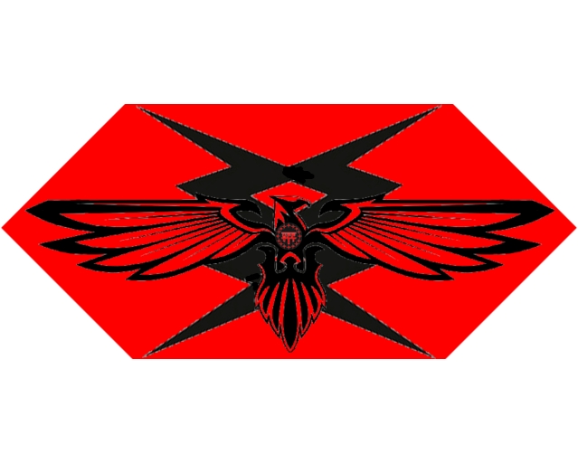 |
 April 19, 2016 - 5:14pm | Kind of like the MSO logo but might like it better with some tweaking: bring the letters to the top so the staff doesn't obstruct and a border of gold braid would finish it off nicely. The alternate central party logo works and may just reflect being designed by a vrusk. One logo reminds me of gay pride banners ( this comment is not a criticism of gay pride). It's like word association: East/West or Dog/Cat almost impossible to avoid because of the similarity. Might be best to redesign, IMO. One looks like the poorer cousin to the Puerto Rican flag. Suggestion: switch the Star to a ringed gas giant or something different or even the representation of a comet with the back story being that the party was formed in the same year when comet X showed up thus the comet represents the origin and history of the party and is a promise to itself that it will endure as a party till the next appearance of the comet in FY 111. I might not be a dralasite, vrusk or yazirian but I do play one in Star Frontiers! |
April 19, 2016 - 5:50pm | You do realize your Liberal Party emblem is a sideways Texas State flag. Liberal is a cusse (spelled correctly) word in Texas. Sounds like a great job but where did you say we had to go? |
April 19, 2016 - 6:53pm | ^Yes Ratt, it's been pointed out to me. Though the party in question's description would fit the "classic liberal" definition of the term. I re-did it anyways already and will probabably put it up soon. Jedi: the rainbow is intrinsic to the original BR logo design (predating any such controversy by a bit), so I'm inclined to keep it on that basis. Re the MSO: that would, wouldn't it? But beyond my capabilities unfortunately. And I hadn't considered your observation about Vrusk influence in the CP logo. Interesting thought. I wasn't intentionally looking for an insectile influence, more "futuristic fascist" (since that's the vibe the CP desctiption gives off). Might have some more soon. |
April 19, 2016 - 8:04pm | New MSO and LP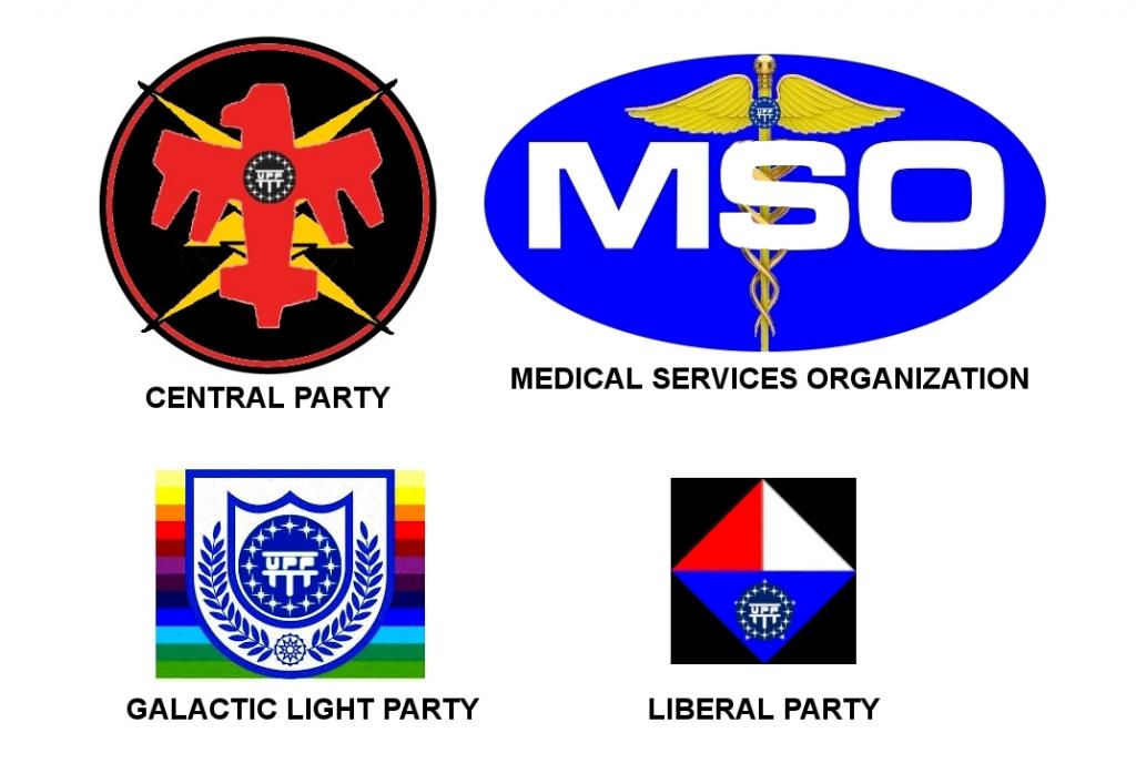 I honestly think the caduceus works better in front of the acronym, but that's me. |
April 30, 2016 - 2:45pm | the rainbow is intrinsic to the original BR logo design (predating any such controversy by a bit)
So was the Confederate Flag, and look what happened with that... |
May 16, 2016 - 12:38pm | Nice "Never fire a laser at a mirror." |
May 16, 2016 - 1:17pm | That is certainly a different take on the Star Devil. Good. You can hardly see the one in the modules anyway. Joe Cabadas |
May 16, 2016 - 1:37pm | ^Actually, it's as close as I could get to recreating the original, which was my goal. |
May 16, 2016 - 3:14pm | ^Actually, it's as close as I could get to recreating the original, which was my goal. Noted!  Joe Cabadas |
May 18, 2016 - 2:16pm | Dralasite devil : I might not be a dralasite, vrusk or yazirian but I do play one in Star Frontiers! |