 January 11, 2012 - 10:44pm | Very cool, but pretty difficult to make up for yourself. Would make a good product to offer as a supplement. The top down view always seemed like the best mapping system for table top gaming. |
January 11, 2012 - 11:15pm | It makes for good eye candy, but just look at how much space you need to dedicate for such a small area. |
January 11, 2012 - 11:44pm | It makes for good eye candy, but just look at how much space you need to dedicate for such a small area. 
|
January 12, 2012 - 5:22am | Actually, I think the transparent wall look is very useful. This gives you an estimation of how tall an object is in relation to your characters. It also helps establish what they are actually seeing visually. While not absolutely necessary, I think it would be useful and incite a more visceral experience, making it easier to imagine what is being seen. Suggestion: I think the doors should also be transparent. We should very clearly see the squares on the other side of the door. Suggestion: The archway should be better represented in order to relate the height of the passage. Suggestion: Don't ever color it. Color would make it difficult to perceive things the way this transparency very clearly communicates position and relativity. Suggestion: The traps should probably be represented by an "X" within a solid border box on the side where the trap is sprung, and each of the other sides should be dashes. View my profile for a list of articles I have written, am writing, will write. "It's yo' mama!" —Wicket W. Warrick, Star Wars Ep. VI: Return of the Jedi "That guy's wise." —Logray, Star Wars Ep.VI: Return of the Jedi Do You Wanna Date My Avatar? - Felicia Day (The Guild) |
January 12, 2012 - 6:20am | Frankly I found it confusing. Look at the line going from the door to the trap. It is drawn to the left side and then connected to the wall on the hallway. Makes it look like the trap is level. I am going to say this is not a huge problem and only a small mistake on one map. How is this supposed to be used though? Is it a GM map because showing it to players would reveal to much. As a battle map it coud be very useful for showing exactly where figures are located in relation to features over flat maps where the overhead obstructions are often forgotten. Sounds like a great job but where did you say we had to go? |
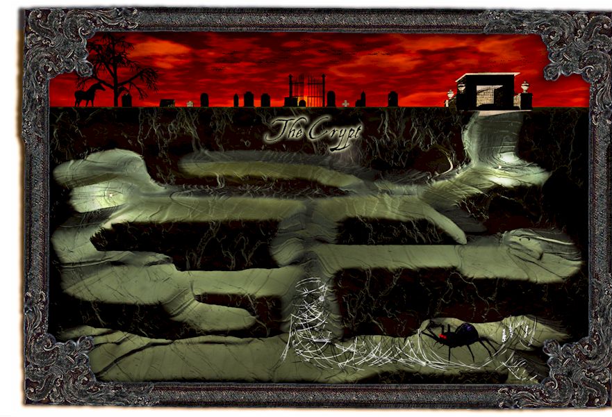
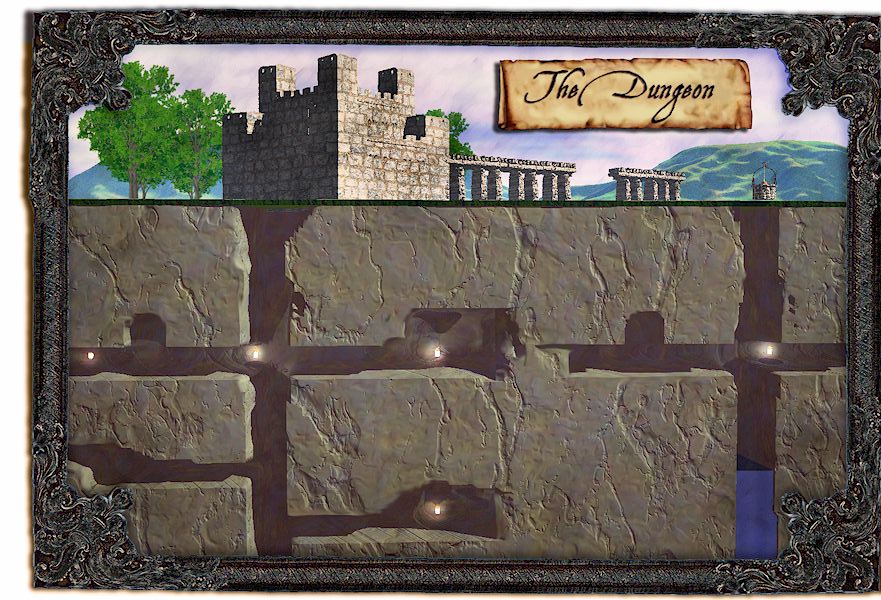
 January 12, 2012 - 7:08am | Another technique that could be tried is a side view of a dungeon, I saw this done with a fairly linear and short dungeon more or less representing a mine shaft with a spider lair at the bottum, it was actualy more a bit of art then a graphic map. It was usable as a dungeon map as long as you were willing to be a little bit abstract about it. As I think about it now it would also make a great player handout- the map/art is what the players get for a map though the actual map is a bit more detailed and holds a bit more surprises. oooh too bad I washed my hands of D&D as that would make a great evening worth of play. I cant locate the original map that actually inspired me but I did find these two examples: Or this:  I might not be a dralasite, vrusk or yazirian but I do play one in Star Frontiers! |
January 12, 2012 - 7:13am | Frankly I found it confusing. Look at the line going from the door to the trap. It is drawn to the left side and then connected to the wall on the hallway. Makes it look like the trap is level. I am going to say this is not a huge problem and only a small mistake on one map.
How is this supposed to be used though? Is it a GM map because showing it to players would reveal to much. As a battle map it coud be very useful for showing exactly where figures are located in relation to features over flat maps where the overhead obstructions are often forgotten. I was thinking about that myself. If you just keep a 2-D map for the GM, with the traps on it and the isometric map for the players, then the players get a better look at their environment, and the GM knows all he needs to know about the environment. View my profile for a list of articles I have written, am writing, will write. "It's yo' mama!" —Wicket W. Warrick, Star Wars Ep. VI: Return of the Jedi "That guy's wise." —Logray, Star Wars Ep.VI: Return of the Jedi Do You Wanna Date My Avatar? - Felicia Day (The Guild) |
 January 12, 2012 - 9:05am | Thanks for all the suggestions, now that I've powered down for the night, I think this is a great reference tool for the GM - to know heights and to explain to players in more detail. The trap - it's a problem, I know. The room in front of it messed me up. I want it to go deeper but the lines of the wall and the trap wall didn't align, so I shorted it. The size - you can definitely get more real estate 2D. A 3D map showing a portion of Port Loren might be fun for an encouter, show it to the players and say, "From your vantage point this is what you see." Color - today I'm told there will be a demo on lighting and shading, we'll see how it goes. |
 January 12, 2012 - 9:06am | Thanks for all the suggestions, now that I've powered down for the night, I think this is a great reference tool for the GM - to know heights and to explain to players in more detail. Err, Ascent has a better point. +1 |
January 12, 2012 - 12:36pm | Another technique that could be tried is a side view of a dungeon,
That reminds me of the Haunted Keep sample adventure from the Moldvay Basic D&D rulebook. |
 January 13, 2012 - 7:31am | Side views are awesome. SS is this what you are referring to? D&D and SF, makes are great perspective map for space stations, mines, caverns and even large buildings. :-) |
January 13, 2012 - 8:40am | Love that one for showing the connections between the levels. Have to remember that for space stations and ships. Sounds like a great job but where did you say we had to go? |
 January 13, 2012 - 9:53am | Side views are awesome. SS is this what you are referring to?
I always thought that the far right shaft that comes down to some slightly curving stairs and enters the natural cavern was the location depicted in the Erol Otis box cover of the female magic user and the male fighter taking on the dragon coming up out of the water. D&D and SF, makes are great perspective map for space stations, mines, caverns and even large buildings. :-) I might not be a dralasite, vrusk or yazirian but I do play one in Star Frontiers! |
January 13, 2012 - 12:18pm | Side views are awesome. SS is this what you are referring to?  Yep, that's the one. There's another one in the older Holmes basic rulebook as well, "Skull Mountain". It's not quite as elaborate as this one though. I actually made a decent 2D map of that Haunted Keep profile from the Moldvay book as well as expanding the Gatehouse encounter for players that peaked (lv3) the Basic adventures, complete with a mated pair of dragons in the natural cavern area. (Jedion, you're not the only one that thought that of the Otus cover  ) )The female resides in the upper left area, the larger male in the lower right. The male tries to convince players to dig out a cave in from the upper left lair which once led to the outside in exchange for treasure...and then hunger overcomes him afterwards LOL |
 January 13, 2012 - 12:54pm | I'm very happy with my drawing, for a first attempt. Still waiting for the famous Fantastic Maps to finish the lighting tut. I'll see if these types of maps have a home in the fanzine. Thanks for all the compliments. :-) |