 January 28, 2011 - 10:59am | WOW! Impressive. Most impressive. The star system names bleed a bit with the background making it hard to read. |
January 28, 2011 - 11:55am | Most impressive indeed. What program are you using? Suggestion: Do the system names in white, and possibly even a bold-faced font, so they'd stand out a little bit more. " 'Beware the Beast, Man, for he is the Devil's pawn. Alone among God's primates, he kills for sport, for lust, for greed. Yea, he will murder his brother to possess his brother's land. Let him not breed in great numbers, for he will make a desert of his home and yours. Shun him; drive him back into his jungle lair, for he is the harbinger of death." |
 January 28, 2011 - 1:23pm | I'm using Truespace 4.3. Nowhere as powerful as Max or Maya, but a lot cheaper. And perfect for the work I used to do on it (technical schematic cutaways) It is also good for animations. The UPF frigate in my Avatar was made in truespace. I was using the Star Frontiers Font but think Arial would be more readable. The font's are actually white masks made in photoshop. This is more a proof of concept and I already have more idea's. I will half the size of the stars but ring them to stand them out. The transit lines I want to mask with the jump number superimposed. I will probably use a 2D representation for the nebula's. unexplored stars are all currently white. I have some more reading to understand what the expanded stars are before I add them in. |
January 28, 2011 - 1:34pm | This is cool but it brings up the question of actual coordinates for each system. in a 2d (flat map) it doesn't matter but on a 3d map X and Y coordinates do matter, and If I'm correct would actually affect jump distances. This of course is an area I am not familiar with so perhaps one of our resident Space scientists might chime in on this. Maybe someone with the requisite skills might be able to calculate the proper X and Y coordinates that would work with the jump distances given, which would really give us a whole new look to the Frontier, but I think they're all busy right now figuring out thrust speeds and turning radius on another post.  "Hey guys I wonder what this does"-Famous last words "Hey guys, I think it's friendly." -Famous last words "You go on ahead, I'll catch up." -Famous last words "Did you here that?" -Famous last words |
 January 28, 2011 - 1:52pm | considering the map was made on a sheet of grid paper and the distances rounded off....I think I'll accept the flat plane map style. Consider that the Frontier is on one of the THIN edges of the galaxy and there is very little variation from the galactic plane. Might I turn your attention to some great 3d games. The homeworld series uses 3d space to great effect and is one of the best around, but turning that into a board game would be impossibly complicated. But consider Sword of the Stars (which I highly recommend). The star map is a 3D wonder that you can twist and turn and zoom in and out of. Yet the system map for combat all occurs on a plane. ships move up and down to avoid one another but the action is generally 2D. |
 January 28, 2011 - 2:09pm | @BlueKomet: I was going to ask about the font. Personally, I'd say stick to SF font and forget ariel, but that is just my preference. very nice map though, i was wondering how I can get it projected as a 3d hologram in the air above my computer. Also the Sathar do have jump route from Truane's STar to Cassidine as evidenced in the 1st Sathar war. I might not be a dralasite, vrusk or yazirian but I do play one in Star Frontiers! |
 January 28, 2011 - 2:15pm | See now I need to differentiate trade routes from less used routes. The font does have that seventies sci-fi feel...... |
 January 28, 2011 - 2:43pm | See now I need to differentiate trade routes from less used routes. The font does have that seventies sci-fi feel...... I wouldn't list the sathar route, I was just making a comment on the secret routes, But I would love to see the full Zebs map. I might not be a dralasite, vrusk or yazirian but I do play one in Star Frontiers! |
 January 28, 2011 - 3:49pm | @BlueKomet When using the StarFrontiers font, if you have the ability to input special characters, there is an A that is designed to slide up under overhanging letters like T, V, P, etc. I don't remember the character code off hand and for some reason I can't pull up the software I used to make the font to look it up. If you can use it, you can fix the gap in the names of Truane's Star, Dixon's Star, Madderly's Star, and Fromeltar. There is also a special character that is an R with a long tail (like in the logo) that you can use as well if you wish. Ad Astra Per Ardua! My blog - Expanding Frontier Webmaster - The Star Frontiers Network & this site Founding Editor - The Frontier Explorer Magazine Managing Editor - The Star Frontiersman Magazine |
 January 28, 2011 - 8:35pm | Did a little work on my dinner break and have a few things I will be changing. Will update tomorrow. Any suggestions are appreciated. I will also add in the Zeb planets while I'm at it. The names are being done as white mattes in an old copy of Photoshop so I have kerning ability that might help with the font. Planets are being scaled down but transit routes are being spiffed up. My idea is eventually make a good hi-res map for download and a good panning annimation to send to youtube (though that will take a while to render properly) |
 January 28, 2011 - 11:24pm | SMall update of the direction i'm heading in...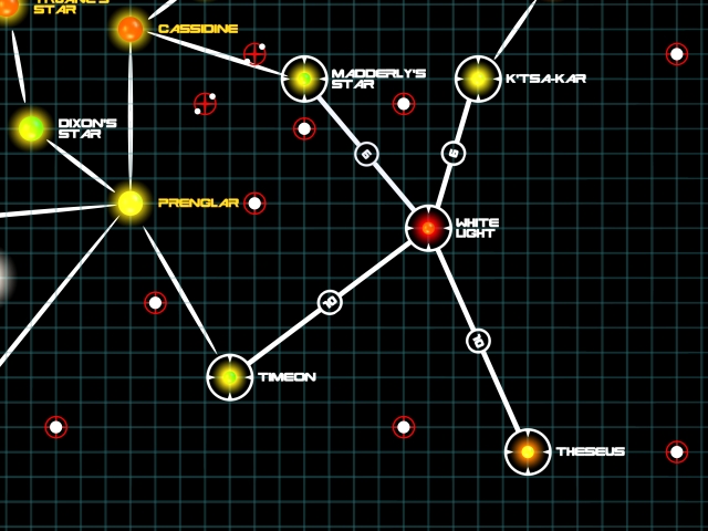  |
 January 28, 2011 - 11:38pm | very nice. By the way, the special characters are #161 for the A and #172 for the R (replacing the inverted exclamation point ( ¡ ) and the not sign ( ¬ ) respectively). Ad Astra Per Ardua! My blog - Expanding Frontier Webmaster - The Star Frontiers Network & this site Founding Editor - The Frontier Explorer Magazine Managing Editor - The Star Frontiersman Magazine |
 January 28, 2011 - 11:52pm | Thanks, I'll look into the font tomorrow. The new style looks a bit cleaner and 4x anti aliasing has sharpened it up nicely. I can probably rejiggering the rest of the map and add the zeb planets tomorrow while my wife is out tomorrow night with the girls. Once that is done I can start thinking about the nebulas. And the plague planets (I never read the Zeb guide so I don't actually know what that means but I hope it's not the swine flu) |
January 30, 2011 - 12:02am | I like your map. I'm very interested to see the youtube video. I have been working on a 3D map using Celestia where I kept the X and Y locations true to AD and Zebs and tweaked Z to work with the printed jump distances on the AD and Zebs maps. Check out: Refer to: 3D starmap software -iggy |
 February 3, 2011 - 11:59pm | Map updated with Zeb systems. need to add jump distances next. |
February 7, 2011 - 1:17pm | I suggest take it back to the slanted view and remove the grid or change its color and blur it out, if you can. (I like it without the grid the way you had it originally.) I think the connecting lines should be a different color to let the names stand out. I also suggest a more techy way of indicating the nebulaes, or else something more realistic. Currently they look too blotchy. Doing a great job so far, though. View my profile for a list of articles I have written, am writing, will write. "It's yo' mama!" —Wicket W. Warrick, Star Wars Ep. VI: Return of the Jedi "That guy's wise." —Logray, Star Wars Ep.VI: Return of the Jedi Do You Wanna Date My Avatar? - Felicia Day (The Guild) |
 February 11, 2011 - 7:37pm | White Light and nearby systems |
 February 12, 2011 - 8:44am | I love them angled! They are totally awesome! I've pawed your maps for the next issue of the Star Frontiersman - unless you have a higher res versions you'd like to submit?  |
 February 12, 2011 - 1:51pm | I just have to finish redoing the stars rings and I can pump out a very hi res version. I liked my plague system spheres so much I want to ring all the systems as well. I am going to mute down the nebula's as well. I just have to finish some work for my wifes business which is taking some time (all the still captures have to be reshot with a new light setup) let me know a deadline for submission. |
 May 27, 2011 - 7:48pm | SMall update of the direction i'm heading in...   Son unit really likes the 3D objects. :-) Would be neat if this was online and you could scroll and zoom. |
 August 3, 2011 - 2:09pm | Well I dropped out for a while there, real life (and paid work) took over! I'm just tailing down from some website work and am looking forward to finishing the map. Actually everything is there but I am sot happy with some of my layering which takes a while! |
 August 3, 2011 - 3:56pm | Awesome work I might not be a dralasite, vrusk or yazirian but I do play one in Star Frontiers! |
August 3, 2011 - 7:20pm | Awesome work. Especially like the hazmat symbols on some of the systems. My SF website izz: http://ragnarr.webs.com |