

 July 29, 2010 - 9:08pm | I thought I had posted this years ago when I first started it but a search has turned up nothing so I guess I didn't. I remember Ascent commenting on the font so I know I posted it somewhere. Anyway, I've slowly been working on a Star Frontiers font. The original plan was just to make something to reproduce the logo. I did that and then filled in all the other capital letters. Here's a sample of what some logos look like in the font 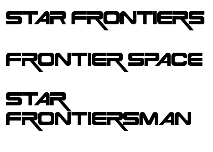 That was a couple years ago. After I did that I started working on the number and punctuation but never posted the update. Well, now it's updated. Here is where the font now stands: All the standard ASCII characters (0-127) are defined. All the capital letters, digits and punctuation have been done. The lowercase letters are just place holders for the moment but at least they won't come up as boxes if you use the font in software. Right now the lowercase letters are just a generic sans serif font. I still need to stylize them. I might need to work the numbers a little as well but I have to think about that. In any case, you should now be able to use the font in other programs. Note: There are two special characters in this font. The first is a capital A that is shifted to the right so that when printed next to a capital F, P, T, V, or Y the spacing is appropriate and there isn't a big gap. This used to be the lower case 'a' but since I'm now working on lowercase letters, I've moved it to ASCII character code 161 instead of the upside down exclamation point. The second is the capital R with the long tail (the one in the logo samples above). This used to be the default capital R but I made the non-tail version the default since the tailed version is more for logo type stuff and not for general use. The tailed version is in ASCII character code 172 instead of the 'logical not' symbol ( ¬ ). I figured we wouldn't need those two symbols in the font. It's a TrueType font and you can download it from the StarFrontiers.info site by clicking on the link below. Enjoy. Star Frontiers TrueType Font Download Ad Astra Per Ardua! My blog - Expanding Frontier Webmaster - The Star Frontiers Network & this site Founding Editor - The Frontier Explorer Magazine Managing Editor - The Star Frontiersman Magazine |
 July 30, 2010 - 8:22am | Very cool Tom. +1 FS has it's own logo/font, fyi. Sorry it's kinda small, it looks better on the book cover which I hope to show off soon. |
July 30, 2010 - 11:38am | Cool. I made that sample image a year and a half ago while FS was still an community project. It was just something related to demo the font on. Who made the FS font or did you guys just find it somewhere? Ad Astra Per Ardua! My blog - Expanding Frontier Webmaster - The Star Frontiers Network & this site Founding Editor - The Frontier Explorer Magazine Managing Editor - The Star Frontiersman Magazine |
July 30, 2010 - 5:06pm | Bill hand-made it for the interior core book and I used it on the Metalist
cards. Another version was made for the book covers (It's orangish-red). Looks very nice, colors were chosen based on the artist rendering of the book cover. |
July 30, 2010 - 7:24pm | Very neat. Anyway, I finished the version 1.0 of my font and added in all the lower case letters. Here's a sample: You can download the font at the original link. Feel free to send any comments on characters you think should change. I have a few ideas (especially with the numbers) but I want to think about them for a bit. Ad Astra Per Ardua! My blog - Expanding Frontier Webmaster - The Star Frontiers Network & this site Founding Editor - The Frontier Explorer Magazine Managing Editor - The Star Frontiersman Magazine |
July 30, 2010 - 9:15pm | Tom, your are It's good to see people use their talents and share. :-) (not my inention to make anyone feel bad) |
July 30, 2010 - 10:05pm | Tom, your are It's good to see people use their talents and share. :-) (not my inention to make anyone feel bad) Dang, for a minute there I thought you had added the font to the website but then I realized it wouldn't work for anyone unless they had already downloaded and installed it on their system. Anyway, I'm glad you like it. The more I look at it I think I need to make the lower case letters a little larger and heavier. They seem a little light compared to the uppercase ones and the capitals really stand out in the sentences. Maybe that is good, I don't know, I haven't decided yet. Also, I think I need to make the numbers a little boxier as well. I'll await feedback from others as well. Ad Astra Per Ardua! My blog - Expanding Frontier Webmaster - The Star Frontiers Network & this site Founding Editor - The Frontier Explorer Magazine Managing Editor - The Star Frontiersman Magazine |
 August 2, 2010 - 7:49am | Yes, the numbers should be boxier. -iggy |
August 2, 2010 - 5:16pm | This looks really cool. Thanks for doing thise. Time flies when your having rum. Im a government employee, I dont goof-off. I constructively abuse my time. |
August 4, 2010 - 6:40pm | Thanks for the update. It will be even cooler when the numbers look like they belong to the font, but that's not to knock your work. I'm glad of any updates to the font. View my profile for a list of articles I have written, am writing, will write. "It's yo' mama!" —Wicket W. Warrick, Star Wars Ep. VI: Return of the Jedi "That guy's wise." —Logray, Star Wars Ep.VI: Return of the Jedi Do You Wanna Date My Avatar? - Felicia Day (The Guild) |
August 5, 2010 - 7:48am | Another update with numerals that match the letters. The big sample font image above (or below depending on your settings) has been updated with the new numerals. Ad Astra Per Ardua! My blog - Expanding Frontier Webmaster - The Star Frontiers Network & this site Founding Editor - The Frontier Explorer Magazine Managing Editor - The Star Frontiersman Magazine |
August 5, 2010 - 11:44am | The numbers match much better! Good job! Now, should zero be slashed? I'm not sure and wandering. -iggy |
August 5, 2010 - 12:37pm | I thought about that but sonce the o's are much wider, almost square, and the zero is skinnier I decided not to. If people think it should have a slash I can try to put one in. The line weights are heavy and adding a slash through the zero would fill up most of the interior space so it may not work (another reason I chose not to do one initially). Ad Astra Per Ardua! My blog - Expanding Frontier Webmaster - The Star Frontiers Network & this site Founding Editor - The Frontier Explorer Magazine Managing Editor - The Star Frontiersman Magazine |