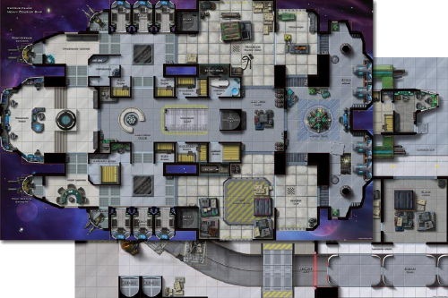
 October 30, 2009 - 9:26am | Paizo just announced their latest map product, Maps of Mystery: Heavy Courier Ship & Offworld Shipping Center, by Christopher West. For more, read here: http://paizo.com/store/blog#v5748dyo5laln Long live the Frontier! |
 October 30, 2009 - 10:53am | Looks like a Star Wars mini's map. Nicely done. If you into miniatures no reason you can't use D&D and SW maps. Thanks Gargoyle!  |
 October 30, 2009 - 11:14am | WOW! |
 October 30, 2009 - 3:19pm | Yeah, Christopher West mentioned that he did a lot of work for the Star Wars minis game, and that the Station map matches up with SW tiles. Long live the Frontier! |
October 30, 2009 - 9:08pm | THat is a pretty cool map. Future Armada already has a bunch of maps. They are awesome. There are small fighters up to large space stations. I have used them almost exclusively in my SF games. http://ki-ryn.com/Future_Armada/Demos.htm At least I got to scare an alien rabbit thingy...... |
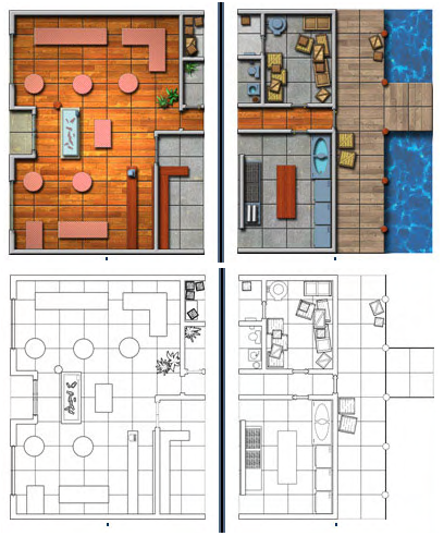
 October 30, 2009 - 10:00pm | @umungus - Those are sweet! Question for the community: Do you prefer color or black & white maps?  I prefer bw maps. I feel that my imagination can fill in the details just like I like it. :-) |
October 30, 2009 - 11:32pm | I prefer color because b/w is hard on the eyes. View my profile for a list of articles I have written, am writing, will write. "It's yo' mama!" —Wicket W. Warrick, Star Wars Ep. VI: Return of the Jedi "That guy's wise." —Logray, Star Wars Ep.VI: Return of the Jedi Do You Wanna Date My Avatar? - Felicia Day (The Guild) |
October 31, 2009 - 9:32am | I prefer color, but I will pilfer b/w when I can. They would be easier to read if the walls were shaded in lik eon real plans. At least I got to scare an alien rabbit thingy...... |
October 31, 2009 - 9:36am | @umungus - Those are sweet! Question for the community: Do you prefer color or black & white maps?  I prefer bw maps. I feel that my imagination can fill in the details just like I like it. :-) I used this very map for a Star Frontiers encounter. I called it the PLasma Grill. The characters were supposed to meet up with a CDC guy to discuss their mission. Of course it ended up in a fire fight... hehe At least I got to scare an alien rabbit thingy...... |
 November 2, 2009 - 1:37pm | I vote for color too. Easier on the eyes. But even black and white versions of these maps are far better than nothing. |
 November 3, 2009 - 9:25pm | Off topic comment, sort of, I once pilfered a deck plan for a catamaran or yatch from the web site of the builder cause it looked good enough to use for RPG- just never had and occasion to use it. Just an idea for a map. I might not be a dralasite, vrusk or yazirian but I do play one in Star Frontiers! |
 November 4, 2009 - 11:06am | Map Scale: What (physical) map do you use in your games? Go vote. :-) |
November 7, 2009 - 4:54am | Black & white works, but those maps simply need more black...that's grey and white, and as such are tougher to discren the details. Color is good as long as it doesn't get too busy or the colors are poorly contrasted (re: blue on purple, red on orange, etc)...that can hurt the eyes even more than a mostly white B&W map. |
November 7, 2009 - 5:30am | Case in point... Compare the lower left B&W image to this one that I retouched:  |
 November 7, 2009 - 5:35am | I found that the mapping software, while producing nice enough maps on the computer screen, left something to be desired when printed as hard copy. I've started to not use the floor textures because the mess up the printed map and kill contrast just making it muddy whether in b/w or color. I will print a map anytime I need one BUT this is the time of year that Staples has cheaper, thinner grade paper on hand for people printing their own wrapping paper. Since it is cheaper I like to get stuff printed on it and since I laminate most maps it doesn't matter that its thin and fragile. I might not be a dralasite, vrusk or yazirian but I do play one in Star Frontiers! |
November 7, 2009 - 9:57am | Agreed Jedion. The problem is that the colors are way too saturated to print. If you can open it in photoshop you can bring down the saturation and it will print much better. It will look pale and washed out on the screen, but print well... At least I got to scare an alien rabbit thingy...... |
 November 7, 2009 - 1:18pm | @SS - love it! I'm a big fan of B&W. Something about this color scheme reminds me of SF back-in-the-day. I find it easier to make maps using MS Word or InkScape. ..but I admit, color really brings out the detail. |