


 September 10, 2009 - 7:52pm | Based on the feedback from the Issue 12 post I've listed the following below. If everyone picked one item to submit per month to write up that would be a great start to having a bi-monthly issue. Also, if you know someone not on this site they may have existing material; send them an email or submit on their behalf (get permission first). Also the Cartoon idea came up several times. I've been in talks with Jedion for about 2-3 months but we could never hook up to complete the toon. Anyone is welcome (and encouraged) to take the ball with a cartoon and run with it.
You Can Help (suggestions)
|
September 11, 2009 - 1:12pm | I wouldn't limit the psychology of that request. You said: "If everyone picked one item to submit per month to write up". Personally, I will submit only what I am inspired to write regardless of what the needs are for the magazine. This makes people think they can only submit one article and of a particular narrow selection, and it might make others feel less inclined to write articles. I think instead a suggestion should be made to send in all the articles they can. Because, at the moment there doesn't seem to be a problem with submissions, but if only 1 article per person per issue is implied, then the article reserves are likely to drop way down. The list of article types isn't bad, and if you say you are lacking in diversity for the month, you could just post what articles you would like people to consider writing. Then some of us may be inspired to write one of the articles suggested. By the way, have you considered using smaller text in the magazine? You could certainly fit more in with smaller text. Currently, the text is quite large. It is half again as large as any real world magazine. I'm sure I've pissed someone off with my preaching here. But remember, I'm just making suggestions, not demands. View my profile for a list of articles I have written, am writing, will write. "It's yo' mama!" —Wicket W. Warrick, Star Wars Ep. VI: Return of the Jedi "That guy's wise." —Logray, Star Wars Ep.VI: Return of the Jedi Do You Wanna Date My Avatar? - Felicia Day (The Guild) |
September 11, 2009 - 4:07pm | Don't be messin' with the large print, sonny! Some of us old farts like it like that! ;) I have to agree the diversity of submissions suggestion. Keep us up to date on which areas are short and it is more likely to trigger inspiration. The weak can never forgive. Forgiveness is the attribute of
the strong. * Attributed to Mahatma Gandhi |
September 11, 2009 - 6:18pm | How long has it been since you cleaned your glasses? There's a feature called "zoom" in your PDF reader. You should try it. There's a feature called "zoom" in your PDF reader. You should try it.  As far as printing, there's always copy and paste or a magnifier. As far as printing, there's always copy and paste or a magnifier.  View my profile for a list of articles I have written, am writing, will write. "It's yo' mama!" —Wicket W. Warrick, Star Wars Ep. VI: Return of the Jedi "That guy's wise." —Logray, Star Wars Ep.VI: Return of the Jedi Do You Wanna Date My Avatar? - Felicia Day (The Guild) |
September 11, 2009 - 6:41pm | @Ascent: Your comments are always welcome. @Georgie: A special edition will appear on oldfartrpg.com just for us! ;-) I agree that I worded that incorrectly, what I ment was we have a handful of submitters and lots of readers, if people could get inspired to write just one piece that would help greatly. Again I worded that wrong... I'll stop now. (Remember there are ppl on sf.org, sf.info, SF-Un and other sites that will not see this post - I should go post over there...should I?) Each issue we are very tight on submissions. I had about 2 or 3 extra and if I remember correctly; I forgot one (sorry jedion) and another one would take to long to clean up and delay the zine even more. For the record I also ran in to a layout problem that Bill fixed. Thanks Bill! Delays, delays! We always lack art. Every issue I troll for art on the 'net and feel like I'm bothering Shell, CJ and GJD asking for artwork 'cause I know they have this annoying thing called "real life". Maybe we need a process to gather submissions? a.) A person that posts on various sites that a new issue is ready and a call for submission (with a list of what we need?) b.) Art seeker. Someone who trolls the 'net for art or lines up artist. (I will still handle art needed for submitted content from my Art Posse!) c.) We start a topic that gives a topical list of what we lack. For example; Equipment, Classifieds, Location. Although this seems to narrow the focus as well. Do we really care if we have 5 submission on Equipment and one Race, Location and maybe a story? Dunno... For the record -- Gergmaster, Sam, Will and I have a special site for submissions. They have real lives (like me) and don't always have time to check the site or gather info. I find that if I post all the submissions we get on the site it takes a lot of time when I could be working on getting the issue put together. Lately I just use email and say; "Hey, can you do this?" For #14 I have a notepad file with notes and whatnot that should speed the process on my side. Lastly - I have a ton of stuff in the pipe-line so were good for the next 2-3 issues. (Shorter issues more often). :-) |
September 11, 2009 - 10:46pm | @Ascent: Your comments are always welcome. @Georgie: A special edition will appear on oldfartrpg.com just for us! ;-) I agree that I worded that incorrectly, what I ment was we have a handful of submitters and lots of readers, if people could get inspired to write just one piece that would help greatly. Again I worded that wrong... I'll stop now. (Remember there are ppl on sf.org, sf.info, SF-Un and other sites that will not see this post - I should go post over there...should I?) As long as you don't use the words "only one" or "just one". "SF-Un"? What's that? Each issue we are very tight on submissions. I had about 2 or 3 extra and if I remember correctly; I forgot one (sorry jedion) and another one would take to long to clean up and delay the zine even more. For the record I also ran in to a layout problem that Bill fixed. Thanks Bill! Delays, delays! If you need a cleanup person (editor), I can do that. It doesn't take long to edit. We always lack art. Every issue I troll for art on the 'net and feel like I'm bothering Shell, CJ and GJD asking for artwork 'cause I know they have this annoying thing called "real life". It's no bother at all. We just don't always have the time. Keep asking. I'm booked for now, but when my time frees up enough, I will let you know. Maybe we need a process to gather submissions? a.) A person that posts on various sites that a new issue is ready and a call for submission (with a list of what we need?) b.) Art seeker. Someone who trolls the 'net for art or lines up artist. (I will still handle art needed for submitted content from my Art Posse!) c.) We start a topic that gives a topical list of what we lack. For example; Equipment, Classifieds, Location. Although this seems to narrow the focus as well. Do we really care if we have 5 submission on Equipment and one Race, Location and maybe a story? Dunno... Works for me. I already cover the WOTC boards. For the record -- Gergmaster, Sam, Will and I have a special site for submissions. They have real lives (like me) and don't always have time to check the site or gather info. I find that if I post all the submissions we get on the site it takes a lot of time when I could be working on getting the issue put together. Lately I just use email and say; "Hey, can you do this?" For #14 I have a notepad file with notes and whatnot that should speed the process on my side. Lastly - I have a ton of stuff in the pipe-line so were good for the next 2-3 issues. (Shorter issues more often). :-) Sounds good. Keep it up. View my profile for a list of articles I have written, am writing, will write. "It's yo' mama!" —Wicket W. Warrick, Star Wars Ep. VI: Return of the Jedi "That guy's wise." —Logray, Star Wars Ep.VI: Return of the Jedi Do You Wanna Date My Avatar? - Felicia Day (The Guild) |
September 11, 2009 - 10:53pm | By the way, I got some stuff in the robot article done. Three more examples and I'm done. I cut the article in half. The second half is being held back for issue #14. View my profile for a list of articles I have written, am writing, will write. "It's yo' mama!" —Wicket W. Warrick, Star Wars Ep. VI: Return of the Jedi "That guy's wise." —Logray, Star Wars Ep.VI: Return of the Jedi Do You Wanna Date My Avatar? - Felicia Day (The Guild) |
 September 11, 2009 - 10:54pm | SF-Un is the Star Frontiers Underground yahoo group (http://games.groups.yahoo.com/group/SF-Un/) Ad Astra Per Ardua! My blog - Expanding Frontier Webmaster - The Star Frontiers Network & this site Founding Editor - The Frontier Explorer Magazine Managing Editor - The Star Frontiersman Magazine |
 September 12, 2009 - 1:42am | I am always happy to submit art, I am currently very busy on the Frontier Space Site, and have submitted over 300 images to the project (So many that I had to compress them into catalog style image packs so when they are needed the originals just have to be requested). I like to write but have little time for it as my "real" life is very busy. If you have something you need tell me what you want, what you want in it, what you want the characters doing etc. The only major limitations that I have at this time with my CGI software is that I cannot do Vrusk or Yaz renders (There are no 3d models on the market at this time that are close enough to these characters for me to alter) If I do anything with these races it will have to be free hand and will be very time consuming. I also dont mind doing cross over stuff with the Frontier Space projects I'm on. I am happy to help I just need to know what projects to do |
September 12, 2009 - 1:45am | I did some preliminary work on some cartoon style characters over at FS but it was not well received at the time. I could spend some more time on that in the future if it would help over here. |
September 12, 2009 - 1:50am | For the record -- Gergmaster, Sam, Will and I have a special site for submissions. They have real lives (like me) and don't always have time to check the site or gather info. I find that if I post all the submissions we get on the site it takes a lot of time when I could be working on getting the issue put together. Lately I just use email and say; "Hey, can you do this?" For #14 I have a notepad file with notes and whatnot that should speed the process on my side. I gotta say it Larry...this trend of posting black text on a dark blue background is killing my eyes faster than small print in the SFman ever could!  |
September 12, 2009 - 12:25pm | Agreed. View my profile for a list of articles I have written, am writing, will write. "It's yo' mama!" —Wicket W. Warrick, Star Wars Ep. VI: Return of the Jedi "That guy's wise." —Logray, Star Wars Ep.VI: Return of the Jedi Do You Wanna Date My Avatar? - Felicia Day (The Guild) |
September 12, 2009 - 1:02pm | I'm another one who likes and needs the bigger font size in the magazine. Keep it. Keep it. It is one of the nice things about the magazine. @Ascent: I clean my classes at least twice a day. Depending on what I'm doing, I may clean them many times a day. (Be respectful to your elders.  . If you live long enough, you will find BIG PRINT is not only useful, but necessary. Ah...Youth...) . If you live long enough, you will find BIG PRINT is not only useful, but necessary. Ah...Youth...) |
 September 12, 2009 - 3:59pm | I'm another one who likes and needs the bigger font size in the magazine. Keep it. Keep it. It is one of the nice things about the magazine. @Ascent: I clean my classes at least twice a day. Depending on what I'm doing, I may clean them many times a day. (Be respectful to your elders. . If you live long enough, you will find BIG PRINT is not only useful, but necessary. Ah...Youth...)As someone who's already wearing glassses, and is expecting a move to bifocals anytime soon now, I couldn't agree more. On that same subject, Larry(and Tom, since he's handling layout), how 'bout we switch the text in the 'zine's body paragraphs to a serif font, as that would make the text easier to follow. For example: Article Title First body paragraph. Any succeeding body paragraphs Headings As Appropriate(albeit in a smaller font size than the title) and so on. "You're everything that's base in humanity," Cochrane continued. "Drawing up strict, senseless rules for the sole reason of putting you at the top and excluding anyone you say doesn't belong or fit in, for no other reason than just because you say so." —Judith and Garfield Reeves-Stephens, Federation |
 September 12, 2009 - 8:06pm | On that same subject, Larry(and Tom, since he's handling layout), how 'bout we switch the text in the 'zine's body paragraphs to a serif font, as that would make the text easier to follow. Thats true and the whole point of serif script: it draws the eye along the line. Plus leaving a small amount of white space in a layout that can reach the pages edge of the page can actually relieve the eye- as apposed to columns of print packed into a page. See SF9 page 47 of the PDF or 45 of the actual document- there is a small amount of white space in the corner thats actually proven to relieve the eye and make it easier to look at a 2 page magazine layout. I'd recommend serif script particularly in large bodies of type. I may be spouting known info here but the human eye actually looks at a top center of a 2 page layout first and then flows in a clockwise circle around the layout. a little bit of white in a corner or edge helps this natural flow. Plus the layout of the elements (each block of text and picture and stuff like side bars or charts is an element) on the page can assist this. The optimum number of elements is 5-7. A classic mistake is trying to fill every inch of space cause "we're paying for this". Anyhow there is a science to making a magazine or a yearbook even more "readable" which has nothing to do with the actual words but everything to do with preventing eye fatigue. I might not be a dralasite, vrusk or yazirian but I do play one in Star Frontiers! |
September 12, 2009 - 9:17pm | Personally I hate reading serif text on a computer screen. I don't print the magazines to read them. I don't have the money, and even if I did, I wouldn't use up resources so frivolously. (Not to sound snobbish. I just don't agree with it. I've been a conservationist for decades now.) View my profile for a list of articles I have written, am writing, will write. "It's yo' mama!" —Wicket W. Warrick, Star Wars Ep. VI: Return of the Jedi "That guy's wise." —Logray, Star Wars Ep.VI: Return of the Jedi Do You Wanna Date My Avatar? - Felicia Day (The Guild) |
September 12, 2009 - 10:06pm | On that same subject, Larry(and Tom, since he's handling layout), how 'bout we switch the text in the 'zine's body paragraphs to a serif font, as that would make the text easier to follow. Thats true and the whole point of serif script: it draws the eye along the line. Plus leaving a small amount of white space in a layout that can reach the pages edge of the page can actually relieve the eye- as apposed to columns of print packed into a page. See SF9 page 47 of the PDF or 45 of the actual document- there is a small amount of white space in the corner thats actually proven to relieve the eye and make it easier to look at a 2 page magazine layout. I'd recommend serif script particularly in large bodies of type. I may be spouting known info here but the human eye actually looks at a top center of a 2 page layout first and then flows in a clockwise circle around the layout. a little bit of white in a corner or edge helps this natural flow. Plus the layout of the elements (each block of text and picture and stuff like side bars or charts is an element) on the page can assist this. The optimum number of elements is 5-7. A classic mistake is trying to fill every inch of space cause "we're paying for this". Anyhow there is a science to making a magazine or a yearbook even more "readable" which has nothing to do with the actual words but everything to do with preventing eye fatigue. Agreed on all counts. @C.J.: I don't print mine out either...I'm too poor to constantly buy ink cartridges. But, my personal expirience, serif fonts and strategically placed amounts of white space, along with some of the other layout tricks Jedi mentioned, go a long way towards relieving watery, strained eyes, whether you're reading the material on paper or on screen. Take Wikipedia(please, take Wikipedia). While the sans-serif font for titles and headers immediately draws attention, the dense paragraphs of sans-serif font in the bodies of its articles(especially the A-class and featured articles) start to swim together and cause a highway hypnosis-like effect(least it does for me), which is especially unfortunate if the article in question has only a few pics to break up the monotony. "You're everything that's base in humanity," Cochrane continued. "Drawing up strict, senseless rules for the sole reason of putting you at the top and excluding anyone you say doesn't belong or fit in, for no other reason than just because you say so." —Judith and Garfield Reeves-Stephens, Federation |
September 13, 2009 - 3:43am | You can print these things? Just kidding, I'm not that computer illiterate! |
September 13, 2009 - 4:48am | You can print these things? LOL I have staples do it and them bind them with comb binding I only pay for color printing on the cover page then have them add a clear plastic cover- the cost is cheaper than buy a War Games Illustrated of the magazine rack. I just cant stand reading PDF on screen or sitting in my computer chair. The last thing I printed on my printer was KH remastered then I hardbound it myself following a tutorial I found somewhere in cyber space. Its obviously homemade but not so bad that I hide it from other players. Very likely to have AD remastered printed and hard bound professionally- was quoted about $25 which is a damn site less than D&D 4th ed. rule books! I was also thinking to get the 3 volturnus modules printed and bound with a bind on card stock cover. Use the covers from SF-1 &2 for the front and back cover. Since all of my original SF materials is over 25 years old I'd like to not add more wear and tear. I might not be a dralasite, vrusk or yazirian but I do play one in Star Frontiers! |
September 13, 2009 - 2:27pm | Agreed on all counts. I've never had that problem. Maybe it's because my eyes are trained for distinguishing details (due to my art).@C.J.: I don't print mine out either...I'm too poor to constantly buy ink cartridges. But, my personal expirience, serif fonts and strategically placed amounts of white space, along with some of the other layout tricks Jedi mentioned, go a long way towards relieving watery, strained eyes, whether you're reading the material on paper or on screen. Take Wikipedia(please, take Wikipedia). While the sans-serif font for titles and headers immediately draws attention, the dense paragraphs of sans-serif font in the bodies of its articles(especially the A-class and featured articles) start to swim together and cause a highway hypnosis-like effect(least it does for me), which is especially unfortunate if the article in question has only a few pics to break up the monotony. View my profile for a list of articles I have written, am writing, will write. "It's yo' mama!" —Wicket W. Warrick, Star Wars Ep. VI: Return of the Jedi "That guy's wise." —Logray, Star Wars Ep.VI: Return of the Jedi Do You Wanna Date My Avatar? - Felicia Day (The Guild) |
September 13, 2009 - 4:36pm | It did occur to me that if the text were a little smaller, I could handle the serif a little better, particularly if it is Advisor SSi or Palatino Linotype. (Both are free.) View my profile for a list of articles I have written, am writing, will write. "It's yo' mama!" —Wicket W. Warrick, Star Wars Ep. VI: Return of the Jedi "That guy's wise." —Logray, Star Wars Ep.VI: Return of the Jedi Do You Wanna Date My Avatar? - Felicia Day (The Guild) |
September 14, 2009 - 1:59am | Since all of my original SF materials is over 25 years old I'd like to not add more wear and tear. Mine are about as worn and torn as you can get without resorting to disintegration. My four rulebooks are in a three ring binder, with pages freed of their staples long ago. Some of those loose pages have the eyelet stickers so they don't slip out again. Not to mention all the writing and extra lined paper additions I added. The referee screen? Two words: scotch tape. Ditto for the mini module that came with it. The two fold out maps tha came in the box sets? Ditto on the two words...and I'm missing a few counters too. My modules are in slightly better condition, with the Volturnus adventure, Warriors of White Light, and Dramune Run sporting themost wear. Not falling apart yet, but far from collectible in value...more penciled in notes in the margins (I wax nostalgic every time I come across one: "Yeah, I remember playing with that group..."). I think my "Beyond the Forntier" series was used once or twice at best. Most of my D&D red and blue box stuff is in similar condition, although my AD&D collection is in remarkable shape (due mostly to the fact I rarely used any of it, I preferred the simplicity of the Basic/Expert game). I did manage to score a near mint pair of SF box sets together in an E-Bay auction about 6-7 years ago for under $10 (not including S/H though), which came with SF:0 & SF:1 along with SF/KH:0 & SF/KH:1 in similar condition. |
September 14, 2009 - 3:03pm | Since all of my original SF materials is over 25 years old I'd like to not add more wear and tear. Mine are about as worn and torn as you can get without resorting to disintegration. My four rulebooks are in a three ring binder, with pages freed of their staples long ago. Some of those loose pages have the eyelet stickers so they don't slip out again. Not to mention all the writing and extra lined paper additions I added. The referee screen? Two words: scotch tape. Ditto for the mini module that came with it. The two fold out maps tha came in the box sets? Ditto on the two words...and I'm missing a few counters too. My modules are in slightly better condition, with the Volturnus adventure, Warriors of White Light, and Dramune Run sporting themost wear. Not falling apart yet, but far from collectible in value...more penciled in notes in the margins (I wax nostalgic every time I come across one: "Yeah, I remember playing with that group..."). I think my "Beyond the Forntier" series was used once or twice at best. Most of my D&D red and blue box stuff is in similar condition, although my AD&D collection is in remarkable shape (due mostly to the fact I rarely used any of it, I preferred the simplicity of the Basic/Expert game). I did manage to score a near mint pair of SF box sets together in an E-Bay auction about 6-7 years ago for under $10 (not including S/H though), which came with SF:0 & SF:1 along with SF/KH:0 & SF/KH:1 in similar condition. Staples and Office Depot both sell plastic page protectors by the bushel and for cheap. Came in real handy when I ran out of other ways to preserve my GURPS Basic Set 2d Edition rules. (Least 'til I found the other way: Getting 3e in hardcover) "You're everything that's base in humanity," Cochrane continued. "Drawing up strict, senseless rules for the sole reason of putting you at the top and excluding anyone you say doesn't belong or fit in, for no other reason than just because you say so." —Judith and Garfield Reeves-Stephens, Federation |
 September 14, 2009 - 3:15pm | My vote is to keep the text size the way it is. I think the font looks cool, and the size is helpful to read when printed. If bi-monthly is too challenging, then we can go to quarterly. A healthy amount of material right now can disappear very quickly so be careful what you commit to! Additionally, with the new reduced length, of course there will be some issues that don't have much in the way of one thing or another. That's perfectly fine. We just want to make sure that one particular article type does not remain neglected for too long. For example, I could see a couple of issues without a new piece of equipment, but I don't think it would be a good idea to go 6 months (ie 3 issues) without any at all. The same policy should be applied to all categories of submissions. Also remember (Larry!) that articles can be broken up into smaller, more digestible pieces. For example, why not have some cliff-hangers in the fiction? |
September 14, 2009 - 3:21pm | I know exactly where you are coming from Shadow Shack. My Star Frontiers (later called Alpha Dawn, I have the originals) rules are cut and in a 3 ring binder with the little eyelets as well. I did that right off. Same for the three Volturnus modules and the Alcazzar module. My other modules are still in pretty good shape and never went under the scalpel. I laminated my map so it's still in great shape. Used to add things in grease pencil and then wipe off later. I had a laminated black on white hex map as well but seem to have lost that one somewhere along the way in the last 10 years. Never laminated my KH map for some reason and it is starting to get pretty beat up. My KH campaign book is missing the cover and the outer most page front and back (they are sitting in the beat up box with all the counters). Ad Astra Per Ardua! My blog - Expanding Frontier Webmaster - The Star Frontiers Network & this site Founding Editor - The Frontier Explorer Magazine Managing Editor - The Star Frontiersman Magazine |
 September 14, 2009 - 4:06pm | The only major limitations that I have at this time with my CGI software is that I cannot do Vrusk or Yaz renders (There are no 3d models on the market at this time that are close enough to these characters for me to alter) If you ask very, very nicely I may have a suprise for you.... 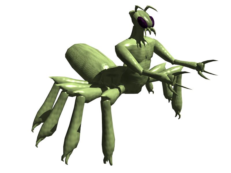 |
September 14, 2009 - 4:49pm | please. pretty please GJD the awesome SF digital artist! |
September 14, 2009 - 4:50pm | By the way, that vrusk rocks! If you got obj format I can import it |
September 14, 2009 - 5:19pm | I think GJD just made AZ_GAMER's week.  Ad Astra Per Ardua! My blog - Expanding Frontier Webmaster - The Star Frontiers Network & this site Founding Editor - The Frontier Explorer Magazine Managing Editor - The Star Frontiersman Magazine |
September 14, 2009 - 5:39pm | Extend the feet down a little so that they can flatten out (like walking on ground), bring in the shoulder joints and get a detailed texture map on that thing, and it would be even more awesome than it already is. (That is, it would be near perfect.) Great job! Thanks for putting the time into that. I know it takes a lot of your time to do something like that. View my profile for a list of articles I have written, am writing, will write. "It's yo' mama!" —Wicket W. Warrick, Star Wars Ep. VI: Return of the Jedi "That guy's wise." —Logray, Star Wars Ep.VI: Return of the Jedi Do You Wanna Date My Avatar? - Felicia Day (The Guild) |
September 15, 2009 - 7:05pm | It did occur to me that if the text were a little smaller, I could handle the serif a little better, particularly if it is Advisor SSi or Palatino Linotype. (Both are free.) If you switch fonts, please use common ones. I downloaded an adventure for another game system a while ago. All the player handouts are unreadable because my computer does not have the correct font and they will not display correctly. Better yet, my computer is unable to even identify the correct font. Usually it can at least tell you the name of the font. But not with this one. Be as artistic as you like, but please use common fonts. It would be a real bummer to be unable to read SF Man because an odd font was used. @GJD: Nice Vrusk. (wish I could do that). |